The famous saying, "A Picture is Worth a Thousand Words" by French leader Napoleon Bonaparte is true when we use graphs to show data. A decision that mathematicians often need to make is what type of average best represents the data set. The box and whisker plot graph can show whether the data points are close together or spread far apart. Here are some things to look for when making sense of a box and whisker plot:
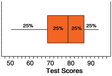
- It displays the range of the data set from the smallest number to the largest (The whiskers of the graph- from 50 to 93)
- The Median, or middle number (79 in the example) shows that 50% of the data is above (79) and 50% is below the median (79)
- A Lower and Upper Quartile, or median between the median and the upper/lower values shows how the data fits into four groups each having 25% of the data. (The box stretches from the low to upper Quartiles- from lower quart 69 to upper quart 86)
To review watch this Khan Academy video of how to create a Box and Whisker Plot from a set of data.
- What strategy does the video use to find the median? Do you find this to be helpful, why or why not?
- The Box and Whisker Plot uses a number line and a scale to plot points on the graph. The video shows two different scales for the Box and Whisker Plot. Which scale makes more sense for the data in the video, Going from 0-100 counting by 10's, or going from 45-67 counting by ones?
- What kind of average would be best to use with the data in this video?
- Where do we use Box and Whisker plots in real life? Share an example of some data that could be displayed in a box and whisker plot.
This comment has been removed by the author.
ReplyDeleteMany of us used the median strategy, where you add up all the numbers,then add one more, and divide the total by two.
ReplyDeleteThis strategy helped us understand us find the median more clearly and quickly.
We also thought that box and whisker plots show us the median and way the data can be grouped together.
The process of learning how to make charts and graphs to show data can be used to compare things, or just think in different ways about things.
Here's a website that shows a football box and whisker plot. It compares the total points scored to points given up by football teams in Illinois.
http://www.google.com/imgres?imgurl=http://www.schoolsnapshots.org/images/fb_screenshot_2012.jpg&imgrefurl=http://schoolsnapshots.org/blog/2012/08/04/an-explanation-of-our-box-and-whiskers-plots-for-football/&usg=__0roF-VRHC7wnziVbD3NebUsN7U4=&h=420&w=650&sz=41&hl=en&start=18&zoom=1&tbnid=FFK_n5xmedRPfM:&tbnh=89&tbnw=137&ei=yd5cUMyJLLCWyAGG3IHQBw&prev=/search%3Fq%3Dmusic%2Band%2Bbox%2Band%2Bwhisker%2Bplot%26hl%3Den%26safe%3Dstrict%26gbv%3D2%26tbm%3Disch&itbs=1